A good logo—whether it’s for a fashion brand, a trendy restaurant, or a golf course—should try to adhere to some of the principles of effective design, including being simple, memorable, timeless, versatile, and relevant—according to popular design blog Tailor Brands.
With golf there’s seemingly endless inspiration to draw from.
Is it in a city that’s known for something? Is there a signature design feature on the course that would work well in the logo? What about the surrounding environment? Is the name of the club enough? Or maybe the location is all that’s needed?
Art is subjective, for sure, but these are my favorite 10 golf course logos. Reply in the comments with yours.

1. Sleepy Hollow Country Club (Briarcliff Manor, N.Y.): Located about 45 minutes from Manhattan, Sleepy Hollow was dubbed by Tom Doak in his book, The Confidential Guide to Golf Courses, as, “Westchester’s best unknown golf course.” The club is somewhat lucky to be able to lean on a centuries-old tale for its logo, but the spectacular drawing of the headless horseman and font choice that can only be described as haunting gives it the top spot on my ranking.

2. Augusta National (Augusta, Ga.): Everyone knows the Masters’ logo. It’s iconic in itself. But the club replaces “Masters” with “Augusta National Golf Club” for the other 51 weeks out of the year, and rarer than that is the “ANGC” iteration of the logo. Even the most casual of sports fans will know what the United States in yellow and green with a flag popping out of Georgia means.
3. Merion Golf Club (Ardmore, Pa.): The host of multiple major championships located about 30 minutes from Philadelphia has long forgone the use of flags and instead uses wicker baskets on top of their pins. It’s no surprise the logo reflects this unique feature of the course. Simple, timeless (it’s been the same for more than 100 years), and relevant.
4. Fishers Island Club (Fishers Island, N.Y.): A cliché used by property experts is that the three most important factors in determining the desirability of a property are location, location, location. Fishers Island is, of course, on an island off the coast of Connecticut (but technically in New York). The logo is a perfect summation: A map of where the course is. (Side note: Twitter went abuzz when Joel Dahmen, paired with Tiger Woods no less, rocked a sun hat with the Fishers Island logo on it in 2018.)

5. Whistling Straits (Kohler, Wis.): The major-championship host facility on the shores of Lake Michigan has one of the finest and most impactful logos in golf. The pencil drawing is dynamic in black and white and features a Greek-mythology type with an impressive mustache-and-hair combination who is, well, whistling. Some say it looks inspired by Herb Kohler, the billionaire executive chairman of the Kohler Company and financier of the resort.
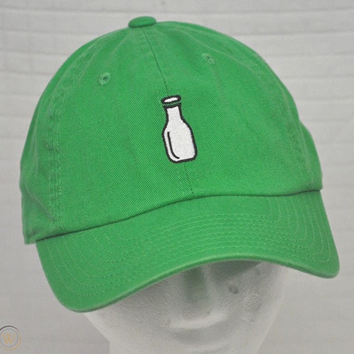
6. McArthur Golf Club (Hobe Sound, Fla.): Bonus points for fun. The Nick Price/Tom Fazio design in south Florida (think Florida’s Pine Valley, if you’re trying to visualize) gets its name from the McArthur Dairy Farms, which owns the property. It’s no surprise then, that the logo is a simple milk jug. I love it because if you showed that to 100 people, I bet almost none of them would say it’s for a golf course.
7. Pinehurst (Pinehurst, N.C.): The sprawling golf resort in North Carolina also has one of the most memorable logos out there. The “Putter Boy” is a staple on the property and a symbol of the resort.

8. Oakmont Country Club (Oakmont, Pa.): As minimalist design becomes more and more popular throughout many facets of life, there’s something to be said about Oakmont’s simple three-letter logo. An elongated “O” is split by a skinny “C” with a third “C” in the center. Long ranked as one of the top clubs in the world, you don’t need anything more from Oakmont.
9. Winged Foot Golf Club (Mamaroneck, N.Y.): The host club of the 2020 U.S. Open is an all-time A.W. Tillinghast design with a memorable logo. Quite literally, it is a winged foot. Why not? Makes sense, is memorable, reflects the club, and unless the club changes its name, it’ll remain relevant forever.

10. Cabot Links Golf Resort (Inverness, Nova Scotia, Canada): I’m partial to Cabot’s Links course logo (although the rare blue lobster of Cabot’s Cliffs course is pretty great, too), but when Cabot burst onto the golf world’s radar in 2011, of course it had to have a ship in its logo. It’s named after John Cabot, the famous explorer who essentially discovered North America, and the pencil drawing of Cabot’s ship is perfect.

There are plenty of options out there—what are your favorite logos?




Love the detail provided all makes sense now